Onsite Check-in app
Check-in shouldn't need a team to run.
- Role
- Product Designer
- Timeline
- January–February 2025
- Skills
- Product Design
- Product Strategy
- Visual Design
- Platform
- Mobile
Overview
Check-in shouldn't need a team to run
At most events, check-in involves at least three people: someone managing the list, a volunteer scanning badges, and staff handling the inevitable exceptions. It works right up until the internet drops, a queue forms, or a first-time attendee can't find their QR code.
This project was Nunify's check-in app, a product used at real events with a real brief: reduce the steps. What we shipped went further than that. We separated two things that had always been bundled together, and pushed check-in toward something that didn't need a volunteer at all.
Operational design
Mapping how check-in actually runs on event day. Not the happy path, but the moment the wifi goes down and the queue starts forming.
Flow reduction
Tracing every step a volunteer took and asking which ones only existed because the system required them, not because they added anything.
Self-service design
Designing for the attendee as the primary actor, and putting the organiser's brand, not Nunify's, on the visible surface.
Problem
Check-in was slow, staff-dependent, and blind.
The existing flow assumed a dedicated volunteer at every station: pick up a device, find the attendee on the list, scan the QR code, confirm. Four interactions per person. For 300 attendees, that's a 40-minute queue before the event even starts. And that's the best-case scenario. Lost QR codes, unregistered attendees, and other exceptions only made the queue longer.
Approach
Redesign check-in around one outcome: no queue.
Mode separation, self check-in, offline validation, and session tracking kept queues moving while giving organisers a reliable view of what actually happened at the event.
Core flows
Four decisions that did the work.
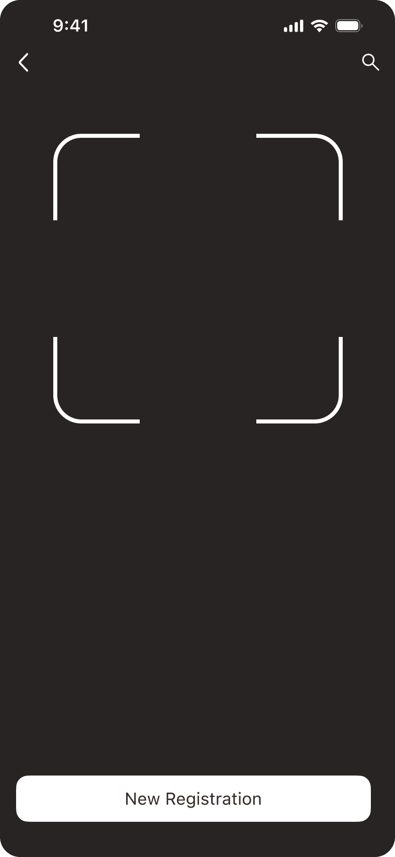
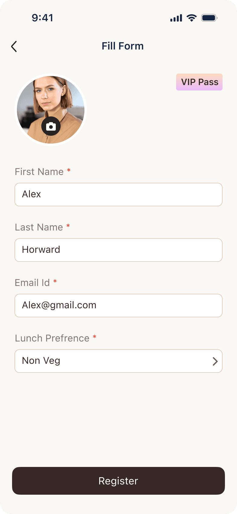
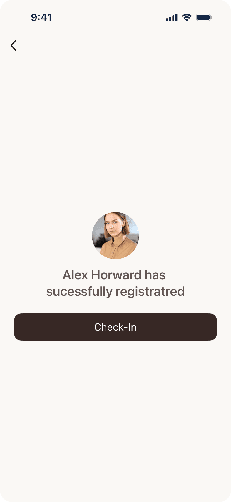
Separate registration and check-in into distinct modes
Previously, onsite registration and check-in were options within the same host flow. Separating them into two modes meant a walk-in gets a dedicated flow that doesn't slow anyone else down. The queue shortens because the exception stops blocking the rule.
Self check-in as the primary mode, not a fallback
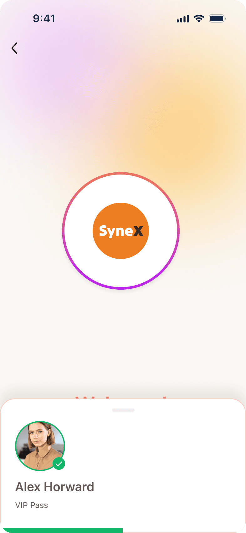
The old system was built around a volunteer holding the device. Flipping that assumption meant redesigning for an attendee who has never used it: immediate confirmation, clear pass/fail, offline validation so connectivity stops being a failure mode. The volunteer becomes optional. At smaller events, unnecessary entirely.
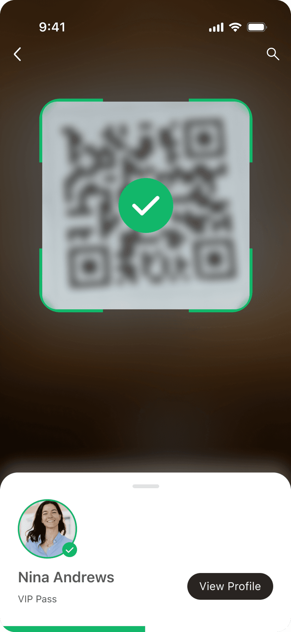
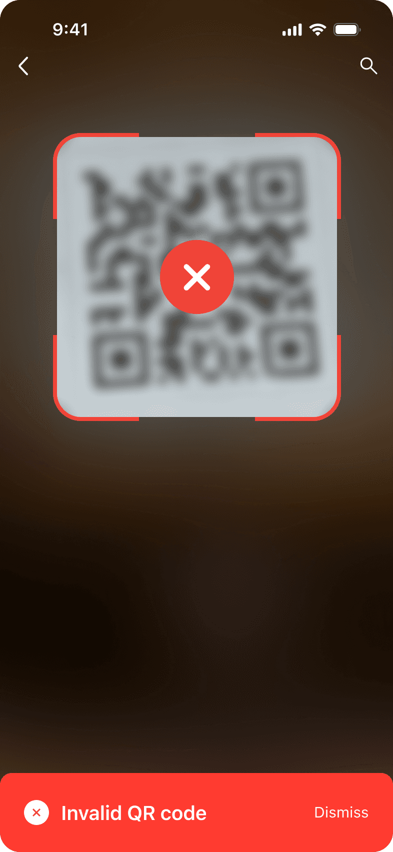
Attendee tracking across the full event day
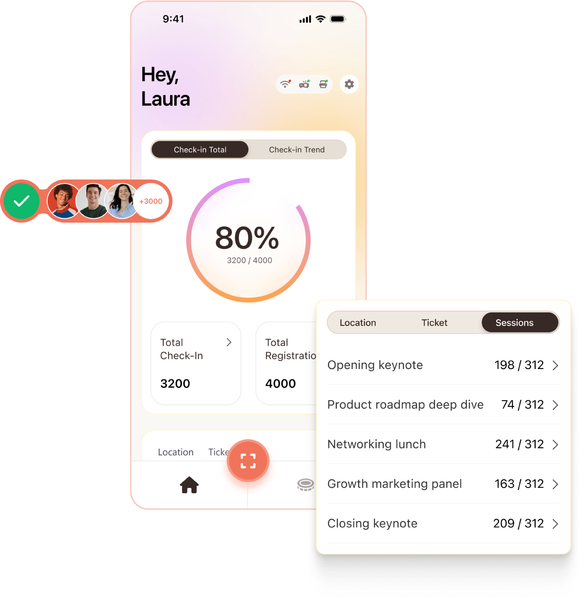
Check-in data answers three questions organisers never had answers to before: which ticket type actually converts to attendance, which locations drew the most footprint, and which sessions people showed up for versus skipped. None of this required new data collection. It was always being recorded. The design work was surfacing it in a form the organiser could act on before planning their next event.
Event branding on the check-in surface
The attendee is at someone else's event. The check-in surface follows the event's brand, not Nunify's. When there's no volunteer present, the interface is the first impression. It should look like it belongs there.
Set up
Configure once, track everything
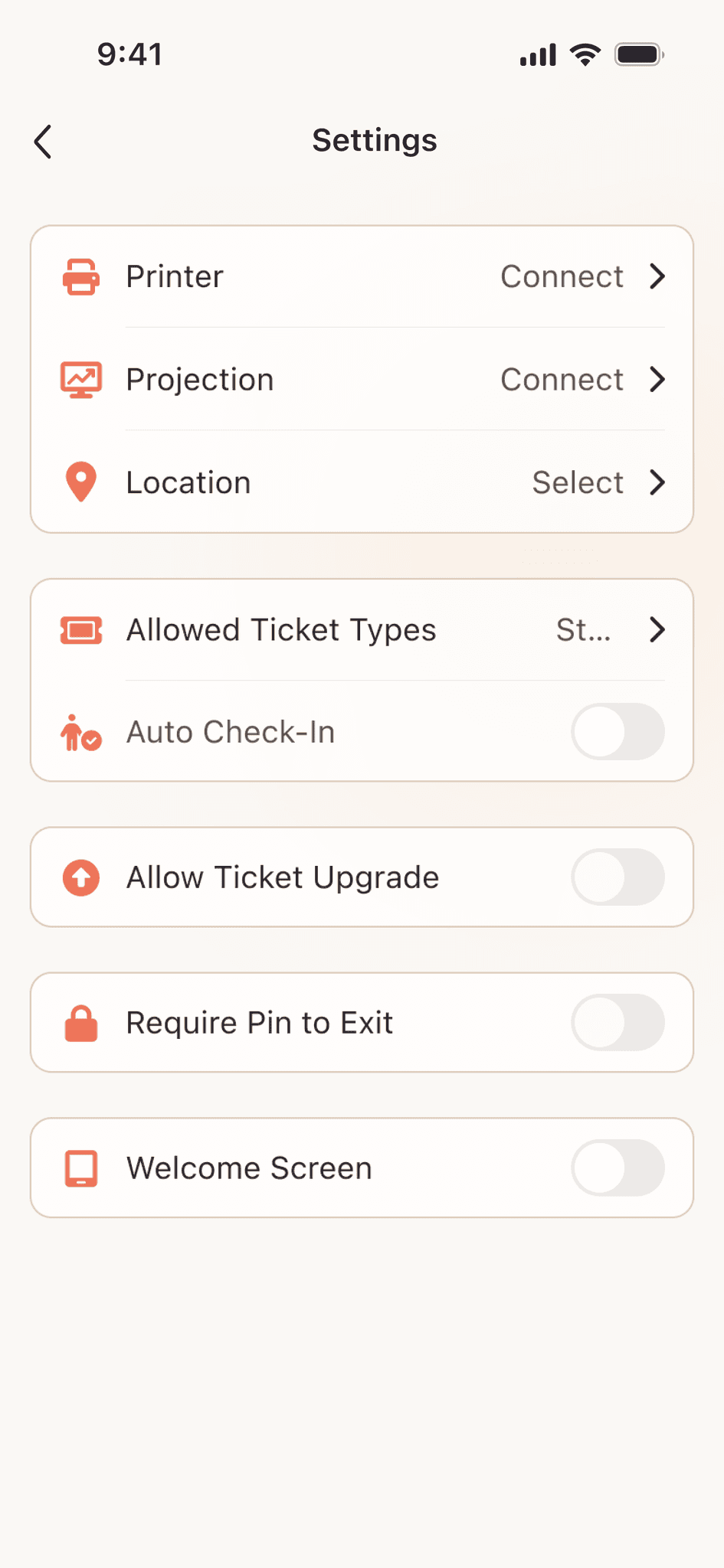
The assumption we were designing toward: if the organiser sets up each station with a location and ticket type before the event, every scan would automatically carry that context. No manual tagging, no post-event cleanup. The data would just be attributed correctly as a byproduct of setup.
The configuration screen was built around that logic. Each station declares what it is: which location it covers, which ticket types it accepts, whether check-in is automatic or needs confirmation. Two minutes of setup per station, before the doors open.
If the assumption holds, the footprint data, ticket conversion rates, and session counts don't need any extra effort to collect. They're a byproduct of how the station was configured. That was the bet.
Reflection
Check-in is a solved problem until the technology changes
QR codes work. But they still require the attendee to do something. That moment of friction is small, but it exists.
NFC wristbands, face recognition, app-based entry: each removes a step. Check-in becomes something that happens to you, not something you do.
No queue to manage means no moment of contact. But the data layer becomes more valuable, not less: real-time crowd density, movement patterns, sessions filling up before they start. The organiser's job shifts from managing entry to reading the room as it happens.