Any event. Any scale.
Minutes to launch.
Event Management System
- Company
- Nunify
- Platform
- Desktop
- Team
- 1 Designer
- 1 PM
- 2 Developers
- Outcome
- +22% organisers
- +66% events created
What is Nunify
Nunify is an event tech platform for events of any type or size. Its product suite covers registration, the event app, check-in, networking, gamification, and exhibitor tools.
Understanding the product
Four places organisers got stuck.
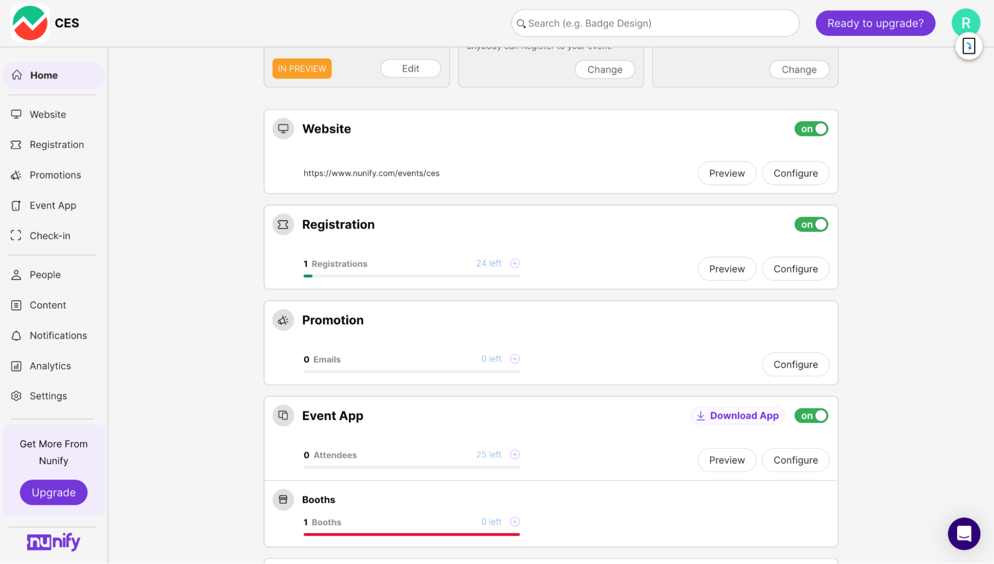
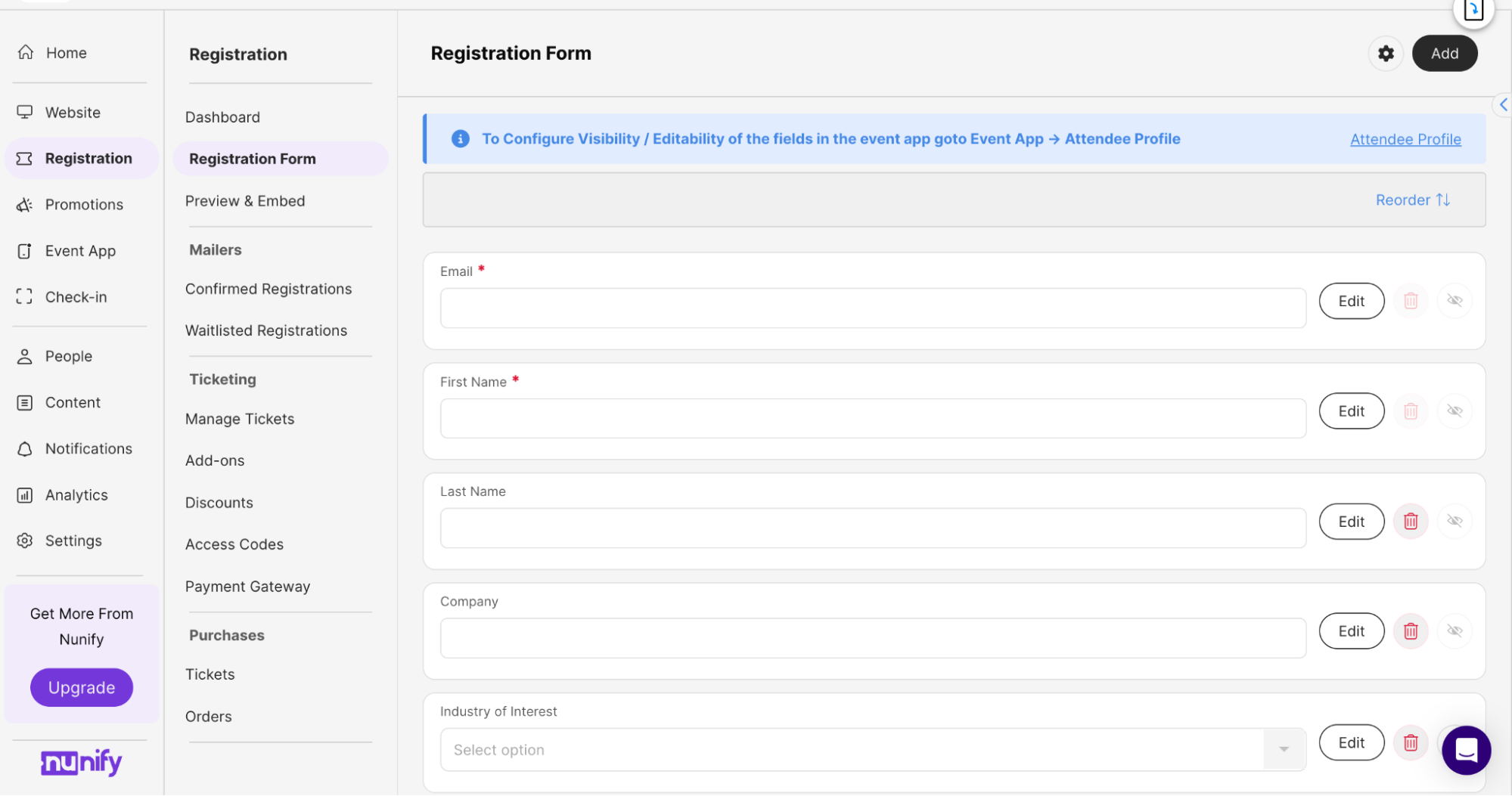
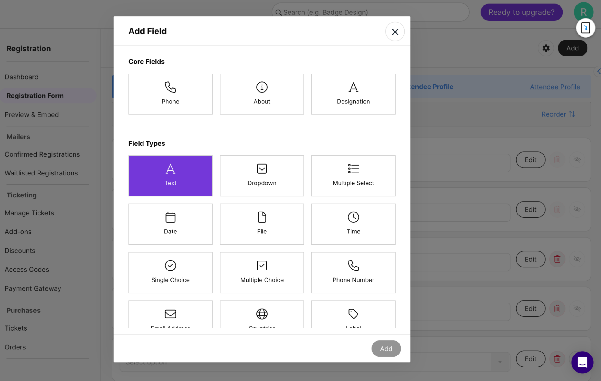
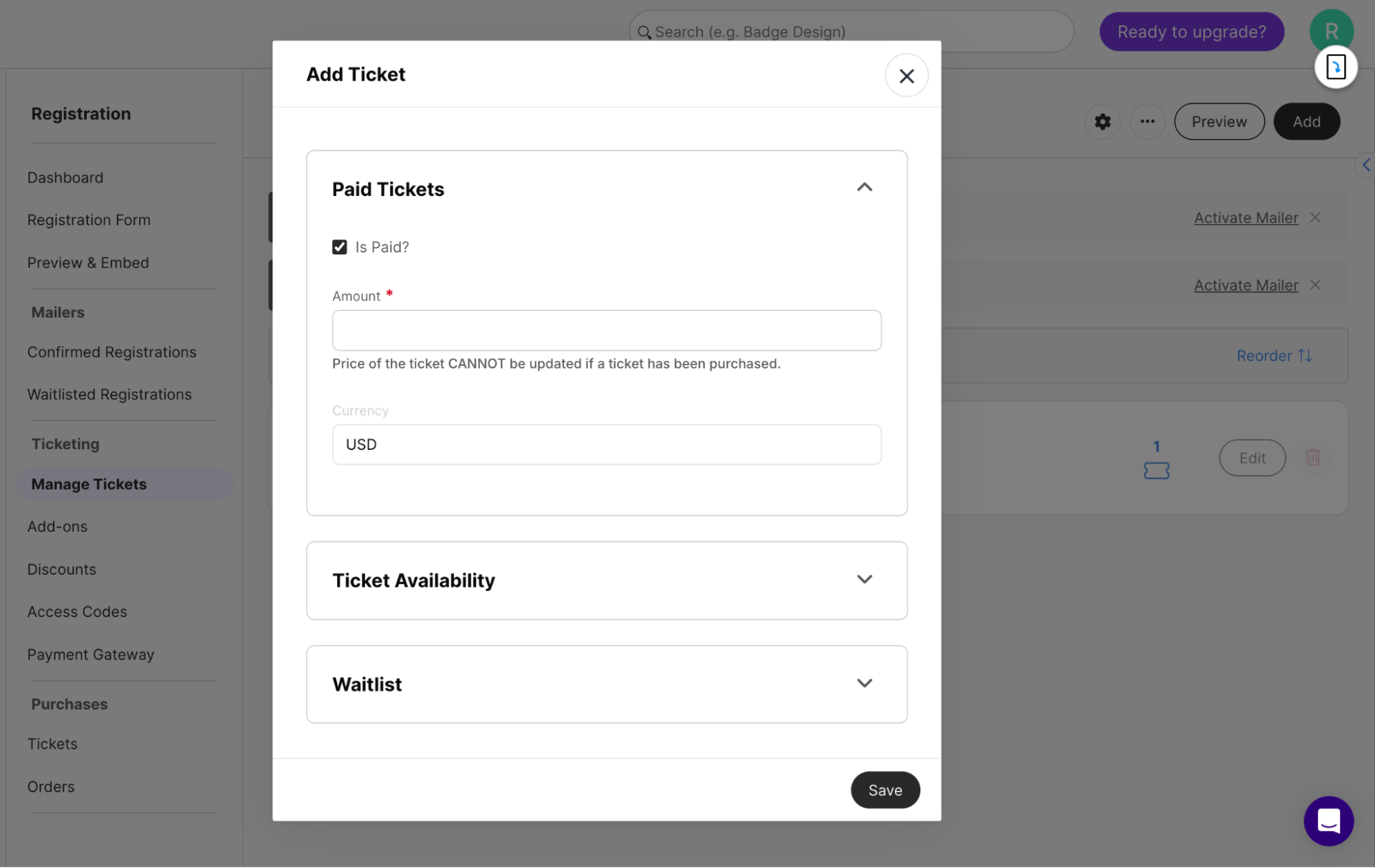
The home screen never changed
It looked the same on setup day and on event day. Open it three weeks in and nothing told you what needed doing that week.
Two menus ate the screen permanently
A menu, and a second menu inside it, both always expanded. You had to keep track of how they related while trying to work.
Bigger events meant more repetitive work
Every form question and every ticket type went through the same popup, one at a time. Scale worked against you.
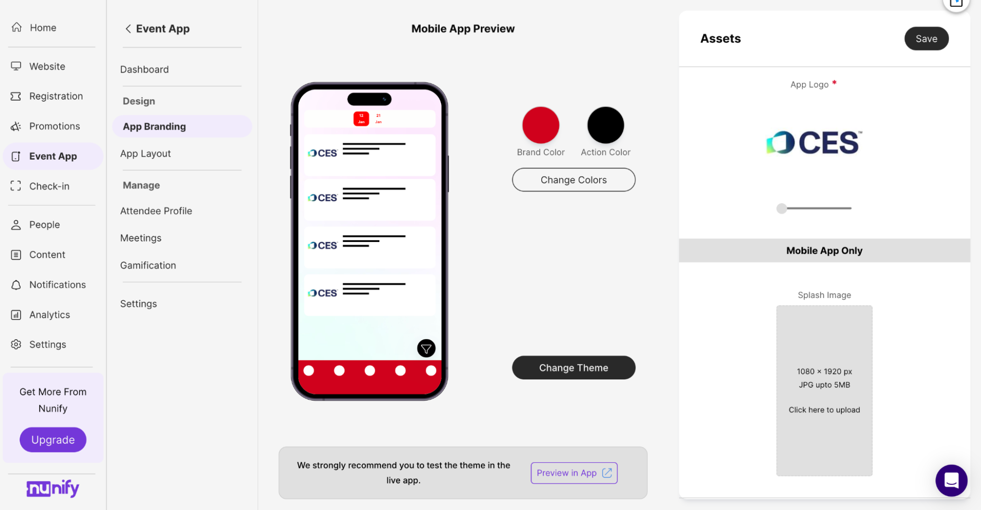
You built the app without seeing it
Colours lived in one part of the menu. Layout in another. Adding pages happened in a popup on top of that. All three build the app an attendee opens, and the organiser never saw it while working.
Problem statement
Get a real event live in minutes instead of days.
By handing organisers something already filled in, letting AI fill in the rest, and showing the complicated parts only when they're needed.
Redesign impact
Less time creating content
Average reduction across the board, for organisers of every event size.
Better content quality
Measured by attendee engagement metrics, not by review.
Growth in enterprise clients
Recorded over the last eight months.
More daily active users
Counted by events created, over the last six months.
Design process
How it went.
01
Audit
- Teardown of the old product
- Where people got stuck
- Patterns in support tickets
- Mapping an event's life
02
Define
- Problem statement
- Goals
- User stories
- What success looks like
03
Ideate
- Three rules
- Event templates
- How the AI should behave
- Dead ends
04
Design
- Design system
- Final screens
- Live preview builder
- Reporting
05
Ship and learn
- Phased rollout
- Adoption
- Support load
- Reflection
Understanding the process
An event isn't one job. It's five.
Stage 01
Setting up
- Features
- Website
Stage 02
Promoting
- Emails
- Campaigns
Stage 03
Taking signups
- Forms
- Tickets
- Waitlist
Stage 04
The day itself
- Check-in
- Networking
- Live changes
Stage 05
Wrapping up
- Numbers
- Follow-up
Runs across all five
Engagement isn't a stage. It's all of them.
Polls, games and prizes, notifications and the app feed all run from the day the event is announced to the day it ends. That's exactly why the old home screen couldn't just be a checklist you work through.
Define
What we were aiming at.
Cut the time from signup to live
Let organisers do their own setup again
Surface features nobody was finding
Make the home screen useful every day
Build one design system
Who we're solving for: organisers, and the support team.
Ideation
Three rules decided every screen.
Start from a template, never blank
Nine switches all off is a test you can fail. Start from something filled in and the job changes from decide to check.
AI does the typing, not the thinking
A template gets you most of the way there. When your event has something specific in it, you describe that part in a sentence and the AI builds it.
Show complexity only when it matters
The features were never the problem. Showing all of them, all the time, was.
Highlights of the experience
Nine decisions became one
Now it asks what kind of event. Pick "conference" and everything a conference always uses is already switched on, in the right order.
The organiser checks instead of configures. The next screen lists what got turned on and why. Accept it, or fix the one or two that are wrong.
All nine are still there, still changeable.
The AI builds on the page, not in a box
The AI writes into the real screen. No panel, no approve button. It works in the same screen the organiser would have used anyway.
It adds one thing and explains why. Signup form, three questions, because that's what a conference asks for.
Everything it makes stays fully editable. Stop it halfway, change one question, carry on. Nothing to approve, nothing to undo later.
The design decision isn't the AI. It's refusing to make AI-built things a different kind of object from hand-built things.
Drag a feature in, it becomes a tab
Every event app used to look identical. Schedule, speakers, networking, sponsors, polls: all the same size on one screen. An event about talks and an event about meeting people shipped the same app.
Drag a feature onto the bottom bar. It becomes a tab. Three or four fit. Everything else goes in a menu.
Those tabs decide what attendees see first. A networking event opens on the list of attendees. A conference opens on the schedule.
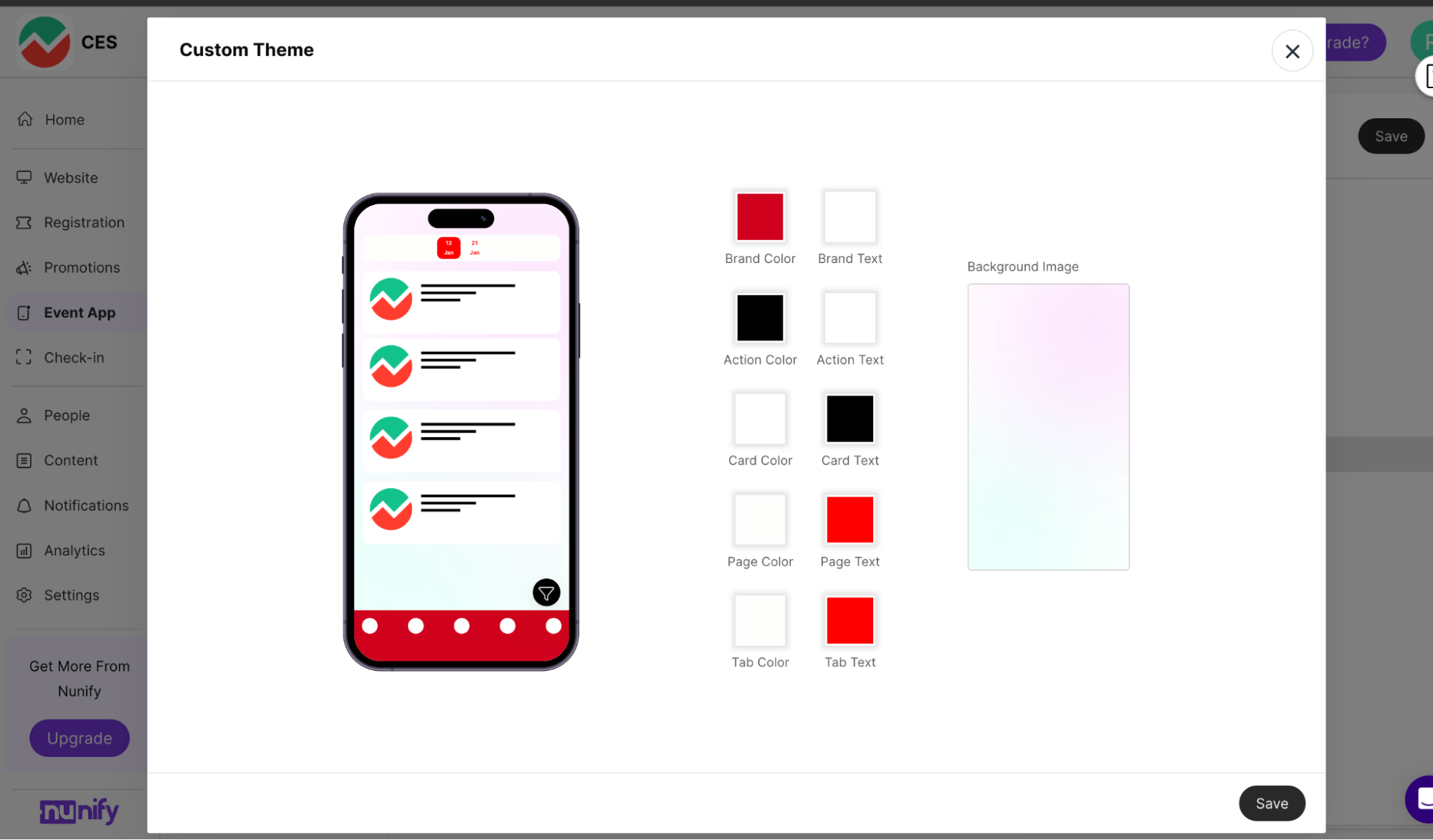
Using existing brand assets to create an app theme
Organisers don't have time to style individual components, and letting them would break consistency across every app page. Theme is set once and holds everywhere.
Reporting leads with what's missing
Every number used to look equally important. Signups, check-ins, app downloads, session attendance. Finding the one that needed attention meant reading all of them.
Now each block leads with the problem. 4,316 people didn't show up, out of 12,000 registered.
The number opens the actual list. It shows who didn't turn up, which is what you'd do next anyway. The number isn't the point. The list is.
Eliminating friction from multi-step flows
Pop-ups disrupted the overall flow, so we eliminated them wherever possible. The previous experience required users to move through multiple steps, with additional back-and-forth clicks between item details, configuration, and other stages, often within long, form-heavy pop-ups.
We counted the clicks across these flows and systematically reduced them to make the experience more fluid.
Before & after. The reskin is the obvious part. Each screen knows its moment. This one: during the event.
Rainy day scenarios
The template doesn't match the event
Everything it turned on is a screen you confirm, not a commitment. Switch things off before anything goes live.
The AI builds the wrong thing
It builds in the open, one piece at a time. Stop it halfway. Anything already placed is editable. No undo, no regenerating.
The organiser needs something no template covers
Every feature underneath is still fully editable. Nothing was removed except colouring individual buttons, and that was on purpose.
Reflection
Setup can't be designed away. It can be pre-filled.
There's always detail someone has to type. The aim was never to remove setup. It was to hand over something already filled in, plus something that could fill in the rest.
Good features aren't enough. They have to survive a week that's already too busy.
Showing the work beat asking for approval. The screen shows exactly what's being built, while it's being built, with nothing to click to check.
Templates sometimes led people wrong. They occasionally walked organisers into a choice that didn't fit their event. Worth it for small events, where a fast good-enough default beats a perfect one nobody reaches. Less sure it's the right trade for the big ones.